Total Pageviews

Friday, 12 December 2014

3 Words | Evaluation

[Final Embroidery]


After previously deciding to go down the textiles route for this project, I explored various things I could embroider. Developing the bacon collages, and expanding my colour palettes. The above image shows one of my final textiles and the one I was happiest with. As these samples took about an hour to complete each one I started to do some simple designs from them. I was really annoyed at myself due to how late in the project I got into it. I felt the final pieces of work I came up with and produced were really strong and had I had more time, I would have loved to develop the samples into a sheet of fabric, perhaps to create a few garments from. I would have taken this final sample and enlarged it, perhaps scaled to a whole piece of fabric. To avoid time wasting, this could have been done onto a piece of blue fabric, the outline of the lines digitally printed on and then embroidery done on top. 

Using embroidery in garments is a skill I have never used before, and one I really enjoyed. Using the machine was actually extremely simple, once the pattern was designed and the colours were chosen there were endless possibilities of patterns that could be produced. I played around a lot on a great variety of fabrics, and although I didn't get a chance to try it I think that neoprene would hold a brilliant combination of digital print and embroidery. During the crit, the majority of my feedback was positive thoughts on my prints and embroidery samples, this was really helpful. A few people said that It was a very interesting take on Bacon's work and one they might not have come up with themselves, I was really pleased with this comment as what I took from the brief was to come up with a concept based on our words, but without copying them. 

When putting up my boards I realised that although I had a lot of development work, I didn't have any final designs. The illustrations above were the only hand drawn designs I produced for this project. Something I found extremely challenging in the project was taking my ideas into physical designs. Looking back at how the entire project went, I feel I should have taken my samples to the stand, or at least digitally put them into designs. I think this would have brought my designs to life, and also helped me move my project forward quicker. However, the designs produced in these drawings were quite a good example of how I would life the embroidery to be used, varying the scale in particular; ranging from intense detail to abstraction. Much like the work of Bacon himself. 

Something I tried to focus on improving in this project was my time management, and I am really disappointed in myself as I don't think I succeeded in this area. I think I could have taken my ideas and concepts much further. On the other hand, I did get a chance to focus on textiles, an area I haven't really covered and I think I really pushed each type of textile and created some great starting points. The group crit was great in this sense, as I got a chance to see how other people interpreted the words I used, and it was amazing at how different some people's outcomes were. I was especially interested in how people developed my word 'Francis Bacon', his work is so stylised I think it was developed in some really interesting ways. My favourite was one students work of digital printing onto silk, the colours were incredibly vibrant and the designs were clearly Bacon, even though the colours and patterns were original. The way she used her prints on her designs was completely different from mine, and it was really inspiring to see other ways of transferring textiles into designs. I was especially pleased with my colour combination, the clash was great, and I feel that it was important to combine colours that so clearly didn't go together as it reflected Bacon's sexuality. He spent his life fighting being gay and his religious background, using clashing colours was my way of explaining this internal fight. I used scale in the same way, mismatching the print scales with each design, sometimes overcrowding it and other times spreading out the print and leaving large sections of the designs blank.


Thursday, 11 December 2014

3 Words | Textiles Development Cont.


For my embroidery, I decided to work into some of the textiles I produced yesterday, on top of the digital pritns. As I have never used the machine before, I had to have a full introduction to it; it turns out the machine is actually extremely simple to use, as long as the file isn't too complicated. As I have been getting more comfortable with the machine, I have gone from just a single colour to 4 different embroidery threads. I tried out a few different textiles to see which matched well with the embroidery, the machine found the faux leather quite difficult to deal with but the result was great, where-as the jersey was a little thin so the machine pulled at it causing rouching. I have found that Calico works best with the machine as it has a good tension, but there could be a better material, perhaps a cotton or denim.

To keep in theme and style of my previous work I have used the designs from the digital print, sometimes simplifying them slightly, and occasionally re-designing it to pick out shapes and colours that looked good. The main thread colours I shall keep to will be black, grey, orange and blue so to stay within my colour palette.

Wednesday, 10 December 2014

3 Words | Textiles Development

[layered textiles (faux silk and calico) 
made from the '3 words' workshop]


So today I decided to produce some samples from the digital prints I have been designing this past week. I printed of 5 A5 designs (twice) on the transfer paper, and then using a variety of materials from faux leather and suede to nylon to muslin, I used combinations of the prints to create an array of samples. The materials that the prints showed up the best on were the neoprene and the nylon jersey. Some other fabrics I found in the scraps didn't show up as well. this could be due to them being natural fabric (the ink won't stick to the fabric) or because my printed design was fading with use. I printed each design out twice as the more you use each paper to print the less colour is left, having each pattern twice meant I got double the use out of each print. Unfortunately, I didn't increase the contrast enough on some of the black and white images, and the prints came out a little lighter than I planned. This however, worked really well on some of the fabrics, but on others it hardly showed up at all.

I found a thick lace material that looked like a laser cut piece of nylon, once printed on it gave some great effects and I will experiment more with this material. Through either layering it on top of other materials, or embroidered into it to add more to the designs or enhance colours.

Tomorrow I have planned to go back to the prototyping and make up some embroidered textiles of the previous designs I have created, this will hopefully include (if it isn't too complicated) the Francis Bacon black and white piece, and the print design from the Bacon collage.
I would have loved to design a laser cutting of the Bacon face, however as I haven't used either illustrator nor the laser cutting machine, so within the time frame it will not be possible for me to design my own file. This is a skill I aim to learn, and will preferably teach myself over the Christmas holidays so that I can develop this project further in my own time.

Tuesday, 9 December 2014

3 Words | Design Ideas

As I have steered away from the physical making of a garment for this particular project, I am completely focusing on textiles. Hopefully throughout my sketchbook it will be clear through the illustrations of how the textiles will collaborate with a collection.

I want to focus my textiles on Bacon's life problems and the worldwide issues addressed in my visit to the Collection Museum; Homophobia, Fetishism and Sex. I want the textiles to remain feminine but also to show emotion like anger and chaos and confusion. The black designs in the textiles remind me of Picasso's Guernica, which represent's pain and struggle much like how Bacon's work is quite a clear reflection of his part experiences. The anger towards religion shown in his Pope series, and struggle with his sexuality seen in his phallic inspired paintings. This symbolic way of designing is an interesting angle to take, perhaps in my designs it can be used for example in the positioning of the patterns, or in the scale.

Photocopying some of my illustration and free drawn pieces, I have used the previous project's technique of illustrating through collage to create new designs as a development but also as ideas for final designs. Designing in this way is really useful as I can position the textile and scale it to size, something that would be replicable on real fabric if I were to make a garment. It also allows me to alter the colour and shape quickly, allowing more designs in the time. To design them I decided to negative one of the 'Bacon' collages, to create more blue hues in keeping with the colour palette. Selecting down 1 or 2 designs from each colour, I will pick out which aspects I think work best and design further from these, including more drawn illustration and fabric samples.


3 Words | Print Designs

[original images and collages]

[print designs]

I took the most exciting abstract work I have created so far and have turned them into a variety of print designs. I decided to keep away from the orange so much as it's used pretty much throughout Bacon's work and I felt it was too much of an obvious colour choice. However, the blue's from his Screaming Pope series have been transferred into my first design, along with some of the browns and a hint of orange. The black and white designs relate much more to my word 'mark' using expressive strokes and layering the illustrations together. As Bacon uses an abstraction of faces to create portraits, usually unrecognisable I have taken this technique and used my '3 minute quick sketch of each word' piece.

I am undecided on fabrics to print onto so I will use a large amount of different materials; from white leather/suede to cotton to mesh muslin. I want to find a fabric that matches the print well, but will also mesh well with embroidery or laser cutting. To layer up the textiles will also include using some very thin fabrics, like silk or a manmade replica. 

Saturday, 6 December 2014

Late at Tate


As I could only visit one gallery on the first day of this project, I decided to visit the Tate Briton for a 'Late at Tate' discussion panel from the fashion designer Nazir Mahzar along with other various talents. The discussion was based on 'Fashion Vs Music'. Mainly discussing which influences which and whether they work together or work off each other. The relevance of music in the fashion world is clear, from the 80's new romantic phase to the skinhead's, the main question was what came first. "the chicken or the egg".

There was some really great modern art shown around the studio's as well as the panel going on, much of it was abstract sculpture but there was also a large amount of digital art. 

Although not directly related to my words, the geometry in the digital art, and exciting shapes and colours in the physical art will inspire my future work. I will bring all of these inspirations to my textiles, as I am not making a garment only samples the more variety of textiles I can produce the better. 


Thursday, 4 December 2014

3 Words | Development

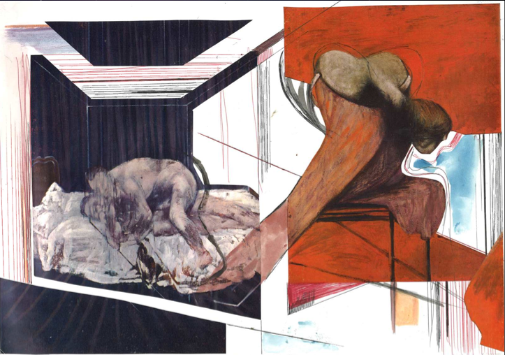
[collage made from Francis Bacon's paintings]


I feel that working into images by drawing or painting into them can produce shapes and silhouettes I might have not previously thought of. So, keeping in theme with my words I decided to 'mark' two of Francis Bacon's paintings through cutting them up, biro-ing into them and painting in lines. I wanted to connect the two so I used the shapes and transferred one into the other. I feel this worked really well and turned out to be quite an exciting piece. This way of collaging could turn into a beautiful print or embroidery. Over the weekend I will design a few prints for some digital printing that I will carry out on tuesday.

I want to design an embroidery pattern, but I do not have the software at home, meaning I will have to wait until I return next week to have a tutorial with the machine. Something I have also been considering was to use either the above collage or one of my word illustration pieces from the first day and transfer it into a laser-cutting file. This layered with prints and embroidery could create some really interesting textiles.

The colours in this collage will become my main colour palette. The orange and blue work in great contrast, chaotic with a hint of sadness; summing up Francis Bacon. I may tone down the colours so it is much less obviously Bacon; using hues of purple-blue's and yellow-oranges.