Total Pageviews

Wednesday, 4 March 2015

Character | Final Designs and Evaluation

[Final Collage designs]

Overall, I'd say this project was definitely my weakest so far, I liked the inital ideas but I feel the time constraint really affected my overall product. I would have liked to produce samples, and perhaps even a garment but unfortunately I could do neither. However, I think the whole idea and design ideas were extremely cohesive with Maddie's promotion project, which was one of my initial aims. 
I was not at all happy with my final designs, I feel they were extremely basic and completely different from how I usually design, which is perhaps why they went so badly. 

I think I had moderate stand work within this project, but if I were to make a final toile, more experimental stand work would be needed, perhaps in a simpler fabric like calico for more shape emphasis. I felt my print work was strong and I liked the colour scheme that came out of the prints. This project was definitely held back by my biggest weakness; time management, and it will be something I will definitely address and massively improve in the FMP. However, I don't feel this project was completely negative and I feel I have made a more successful attempt at each two week project. Minus this last project, I felt each 2 week project was stronger than the one before and I was improving certain skills like quick drawings and stand work. I would have liked to combine my prints into final designs, altering scale and pattern within the simple coat style. Ditto with the unitards and onesies. 

I know I work best when I can get into a topic and focus completely on one thing, so I am sure that the problems I came across in this project will not affect me in my final. I would like to include some promotion work in my final project, photoshoots and lookbooks for example to lift my work and make it more rounded. 

This was the first project since the Industry project that I 'collaborated' with someone on, working with Maddie was really helpful, as she was a week ahead of me, she inspired much of the work I did. As she isn't design, I could have taken this project anyway I wanted, which gave me quite a lot of creative direction. I'm not sure how well I pushed myself on this, and if I were to do the whole project again I would alter the character to produce a slightly more challenging idea. I am definitely not happy with the result of this project, but I feel it has helped me know how to improve and also to push myself to the best I can be. Simply feeling disappointed in the result will force me to not stop at this 'minimal' result I produced. 


Tuesday, 3 March 2015

Character | Design Development

Losing nearly the whole of last week and the end of the week before to portfolio prep and interviews has really taken it's tole on this project. I have a final interview on Thursday, so will have to finish this project early on the Wednesday. Unfortunately this means I will not be able to do any of my printing as I need all the time to finish the project off, but I have chosen materials, and fabric samples that I would use if I had the time.

For the printing, it would be done onto either a silky textile or a neoprime, The neoprime would keep the print strong in colour and also provide a structure to work with. Known for it's use within sportswear it is a perfect material for the girls superhero outfits. The silk is the ideal girlie lining, a mixture of sexy and pretty, keeping their 17 minds at peace and letting Todd, the man of both their dreams admire them.

Using some of my stand work, I have developed my designs to the coat and outer layer of the garment. I think these work really well and have that bad girl attitude I wanted to convey. Taking some of Maddie's photography I will incorporate her images into my designs to further them still.

[Maddie's photography] 


[Initial designs]

As you can see, we both had a similar idea about the colouring and styling of the two girls. I like how cohesive the photography was with the designing it showed that Maddie's character's had a strong personality that we both tried to get across the same story. So far I like how the designs have come out, the lycra with the overcoat is exactly how you picture a superhero, but more wearable. Fashion hero, if you will. the pink hair brings the sassy 17 year old into the mix. With these designs, as they were pretty much still initial designs, simply from the later stand work I decided to not add colour yet.

The superhero girls outfits were meant to be a modern version, sort of a feminist but also ditsy 17 year old everyday outfit; with a flare. The flare however was not going to be a cape, as that is far too obvious. But keeping to that floaty shape I felt the layering and oversized coat gave a similar shape. Over-emphasized collars in certain drawings drew attention to the neck and collar of the figure; a feminine feature. Sexy but strong. Within my later stand work this was an idea I tried to get across, The two fabrics worked well within this. The soft gold crepe showing the feminine soft ditzy side, and the white mesh showing the stronger feminist saving the world side.

Tuesday, 24 February 2015

Character | Prints

[Selection of prints]

Continuing my combination of girlie and superhero, I made a few digital prints from my previous watercolour picture of Adventure Time. I edited it on photoshop to create a few more colours and effects like glow and invert. This neon/fluorescent colour palette works well with the two girls. Bright and silly at the same time. Unfortunately last week was cut short by an interview meaning I had no time to get any of the above prints onto fabric, but this is something I hope to manufacture after the project ends so I can add it to my book. As I have interviews tomorrow and Wednesday, I am worried this project will be slightly lacking, but I will try to catch up on the weekend. However, I am really pleased with how these prints worked out, and I am excited to put them into some designs. 


Returning back to the mannequin for some actual shape I have used two materials; a gold (very superhero) crepe fabric with a different colour back, and a white mesh-like fabric. Using both these materials I created a few bolder shapes onto the mannequin. Hoping to make my designs a bit more conceptual. Due to the nature of this project, the aim of the clothes being designed would be like a superhero suit for the two girls so it needs to be wearable, comfortable and easy to move in. Due to England's grey and changeable weather, I think this should include some sort of over coat. This will be something I hope to bring into designing. The girls, at 17 are becoming women, so will need to feel both attractive and confident in the clothes. the mix of the overcoat and tight undergarments will help achieve this compatibility. The mix of the two materials would be perfect as it is both flashy and stretchy with movement and structure. Mixed with the prints as interior textile and the white on the outside, this sportswear-like idea could be both fashionable and practical. Every girls dream!


Wednesday, 18 February 2015

Character | Stand Work

[Seam stand work and designs]

Due to using all last week for my detailing project, meaning I would only have two weeks to complete this, I decided to get straight into mannequin work. I find it easiest to come up with designs when I get straight onto the mannequin as it forces me into drawing from what I have created. As I had only researched so far I decided it was best to start with seam work on the mannequin to get a few initial designs. As well as this, I started designing some prints from the adventure time comic, using both print and watercolour to create these bright childlike patterns. This was to keep the idea that the two girls are growing up yet still have these immature idea's like loo-rolling their enemies houses. 

[Adventure time print]

To keep within this contradictory idea, I started brainstorming what kind of outfits these girls would like. I started by thinking probably t-shirt and leggins combo, but mixed with the superhero theme I was drawn to the jumpsuit or onepiece. So keeping to basics, from my seam designs I drew classic t-shirts with different collars and seams.

[Stand work and designs]

Also using a simple and quick collage technique I cut out body-tight jumpsuits using different necklines from the mannequin work to produce a small collection of how the prints would look when put onto a body. 

Tuesday, 17 February 2015

Character | New Project

This new project is character driven, the aim being to create designs based entirely on a made up character. For promotion the aim is to create a styling project and photoshoot but as as a design student, I have paired with a promotion girl and have used her character. I will include her photoshoot images to help create my designs. This is the first collaboration project I have done, and although we will be using the same character we will not be working together. It will simply be two outcomes of the same character!
Her character is defined in the images below

"they're inspired by beetlejuice, winona ryder, ghost world the comic, princess bubblegum and marceline from adventure time" - Maddie

So using Maddies character I created a few mood boards; seen below.

[Various mood boards from Sketchbook]

As well as moodboarding the inspirations Maddie set I decided to look at the artist approach to 'superheros' so I looked into futureistic, modernist and minimalism in fashion. The above boards were what I created. I wanted to pick out some colours, textures and mainly shapes to begin working on as moving from inspo to design is normally the hard bit. Hence the more I mood board, the more I have to work from.

The main things that I picked up on were the dreamy nature and movement of a superhero, for example the speed, the bright colours and lights, and the structure of the pieces. From architectural designs equaling strength to the floaty soft shapes of the female body. The surrealist artwork I felt fitting in nicely too, as these two girls were extremely average, but wanted this abnormal life. This extrasuper power. This randomness is something I will focus on, empowering my character in the unexpected.


Thursday, 12 February 2015

Detail | Final Designs

[Final Designs]

As stated in the previous post, I decided to keep in theme with the collaging into my designing. I felt it was really successful, and as it was from stand work I knew it was possible to make therefore helping the designs become more realistic. To go with these I designed a basic flat drawing which could easily be adapted to create the finals. 

Using my earlier colour palette, I enhanced it to make it brighter but kept to the basic colours of blue, purple, pink and yellow. Royal colours, if you will. As it was daywear we were designing for, I decided on outerwear. Embellished jackets and coats as a final 'collection'. I really liked how these turned out and with more time and pattern cutting help I would have loved to have been able to make one. The detailing I felt was really experimental, but also quite obviously Edwardian which was what I was going for. The buttoning detail was able to push really far as it was such a simple detail and I enjoyed placing that on various places in both the stand work and in designing. If I could go back and add in things, I would include some button sampling work as I know it is possible to do on a sewing machine, I would also get some button samples. I was happy with my amount of stand work, I think I created far enough to be able to produce good designs that were make-able but also interesting. 

I absolutely loved this project, possibly my favourite short project to date. Unfortunately I would have loved more time but this was not an option. In the time we were given, I feel I produced a good amount with developed designs. I think my illustrations have greatly improved since the beginning of the project and my creativity within standwork has also improved. With this project running alongside all the interviews and portfolio reviews, I felt I wasn't able to handle balancing the two and could have produced more work if they were not at the same time. This is a problem I need to handle better as it will prepare me for industry. However, I am pleased with how it turned out.

Tuesday, 10 February 2015

Detail | Mannequin Development


[Initial mannequin designs that inspired the toile]

[Toile]

After deciding on a plain idea for a top to focus on the details, I picked the main details I decided I liked the most. The buttons running down the garment, the detachable sleeves and the high collars with big lapels. I took into account all three of these ideas when making my toile and also some of my previous mannequin work. The angle of the seam on the previous work was a little difficult to create with more material so I opted for a more straight-line seam down the front, but kept the down facing lapel. To modernize the look, I added a lapel facing the other way on the other side. If I were to make this for a final I would increase the size of these lapels a great amount to over-emphasize them. 

The sleeve I drastically changed shape of, however I kept the two piece aspect as I thought this added something with the pleating. I switched the way round it was down and added the classical detailing of the buttons the whole way down it that was used so often within Edwardian clothing. As another modern feature I added an over-sized hood and over-sized buttons at the backhand side. This over-sized mixed with the miniature buttons gave a twist on the Edwardian detail seen so much, it placed focus on that particular detail and gave it a new lease of life. The layering; as opposed to being horizontal as seen in the Edwardian dress skirts, I switched to vertically going across the garment. 


Friday, 6 February 2015

Detail | Design Development

[Page from sketchbook]

Using the final work on the mannequin, I created a series of collaged sketches. This helped me work out proportions and also the various designs that could be made from this stand work. This was extremely useful as it helped me realise that I liked the stand work jacket to be a long length oversized coat. If I were to make an official garment it would need to be in a high strength fabric too, meaning it could hold its shape. The buttons and details although worked well on a small scale in design would be quite unrealistic on the scale I wanted. However, with the right machine and fabrication either oversized, or undersized buttons would work well. As my toile was a 360* view it meant I could design the garment all ways, changing bits as I desired. 

Using old designs and collage, I added details onto my photographs like extra frilling or buttons, this gave new ideas on what embellishments could be added for extra detailing.

The bottom three designs were the basis for my final designs. Instead of drawing a line up, for my final designs I decided to keep in theme with the collage designing and use previous mannequin work and edit it on photoshop to create the look I wanted. 


Thursday, 5 February 2015

Detail | Mannequin Drawings

[Pages from sketchbook]


As well as placing the pleated paper onto the mannequin, I also made some seam designs; using a clean strip of paper I came up with a few basic shapes of where collar lines and openings could go on a garment. Making these helped me start up my designs, I was having a little trouble transitioning from initial concept to physical designs. The seams were extremely useful as they helped me lift my designs to a realistic idea of how a garment would fit onto the body. Using collage of some of the mannequin work to create designs also helped me think of new ways of using each detail.

From this point I will use these drawings and collages to create a rough toile of what I could create for my final. Due to time constraint I might leave the toile as a 'semi' final piece and create a line up based on this mannequin work and development. I love the idea of tiny buttons placed around the garment holding together layers upon layers of material. Using this I will create my toile and work from that.

Wednesday, 4 February 2015

Detail | Mannequin Work


After picking out and selecting various collars and details I decided to take them to the mannequin and start applying them in paper form on different bits of the body. As it was only possible to do sections of the details; sleeves, collars, cuffs etc I decided to add on where I could place fastenings in the paper work afterwards. I decided to focus on the collars and detailed layered of edwardian clothing, I used brown paper as it has much more structure meaning It would hold if I put it in obscure places.

As well as this, I photocopied the paper pleat and collaged it onto some sketches, moving around the pleats in areas it could be used and adding fastenings onto my drawings. I kept the colour minimal, adding small amounts of watercolour for extra detail.

This was really useful as it brought my ideas forward, taking the details I was studying and being able to make them into something new. Through moving them around and creating new shapes and ideas on a mannequin it meant I could process how to take these and turn them into more designs. From this stage I have started doing some rough designs.


Tuesday, 3 February 2015

Detail | Idea Development

[Water-colour detail sketches based on dresses from 1901-17]

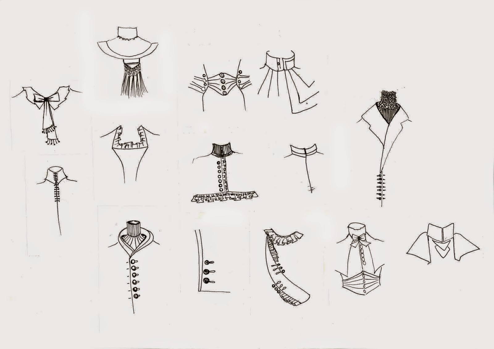
Today I decided to pick out the main details repeated throughout Edwardian dresses, and line them in pen and shade in water-colour. This brought out the delicacy of each detail and inspired me to turn these into some sort of design; textile or development. The shape and silhouette of the dresses remained very similar throughout the entire period, but the details alter dependent on what the dress was for and who would wear it. Similar detailing was used across dresses, this was interesting as the difference between day and evening wear wasn't in shape, length or silhouette. The main differences was the cut of the shoulders and collar, and the detailing on both of these. 

Most dresses included some sort of lace, whether in the form of a collar detailing, skirt trim or simple add-on's to sleeves and shoulders. The embroidery on some of the dresses was intricate, one dress included gold thread all over made to look like layers upon layers of peacock feathers. The dress supposedly 'lit up' when entered the room. Each part of the embroidery was made by hand, and the dress would only have been worn but the richest aristocracy at the finest balls. 

One detail I kept picking out was the incredible amount of layering, every dress had a huge amount of layers, petticoats, skirts, aprons, added lace, frills, jackets, bodices and coats. This could have been due to how cold houses were, or simply to show how much a person could afford simply through the amount of material they wore. 

The colours I picked for the water-colour were mainly based on how I associate wealth with colour. Dyes in that period would have been very expensive, meaning the darker richer colours would only be worn by the wealthiest. Seeing as I am focusing this project on the rich people of the Edwardian Period, I used blues, purples and reds to colour my sketches. I hope to include maybe a gold or white, perhaps in the form of a lace or laser cutting as a physical response.

As I wanted to use these drawings to further my development, I photocopied (enlarging and duplicating) a few of the sketches. With these I can turn them into textiles like prints or embroidery, or simply cut and paste them onto a body to rearrange where each detailing could go. As I only did a few, I feel I need to step my game up and produce at least three times this amount. On top of this, this weekend I shall start to try to recreate some of these on a mannequin. This will help me understand the fabrication methods, and also physically alter where each detail could be placed. I will record this process and start some designing from there. I think I also need a little more research on fabrication, but a trip to the V&A tomorrow should provide a good basis. 


Thursday, 29 January 2015

Detail | V&A

 [Various Edwardian Dresses displayed at the V&A]

[Lace Details]
[lace detailing in fashion with some samples I collected]


The trip to the V&A wasn't as helpful as I thought it would be, mainly because there is a minimal section on the Edwardian Period. However I took images throughout, mainly on detailing around the period. There was a small Section near the Wedding Dresses Exhibition that had period clothing from 1901 to 1920, I noticed the use of lace as a textile across the era, but in particular the main identifiable detailing was cuffs, high collars, large lapels, miniature buttons in lines as fastenings and cravats. The coats of the era were full length normally with buttons the whole way down. The dresses remained long, but lost the large skirts of the Victorian period. 

The Coat-
'These include the reverse collar and lapels, where the outer edge of the lapel is cut from a separate piece of cloth from the main body, and also a high degree of waist suppression, where the coat's diameter round the waist is much less than round the chest. This is achieved by a high horizontal waist seam with side bodies, which are extra panels of fabric above the waist used to pull in the naturally cylindrical drape.'

Something I liked about the dresses was the amount of layers they had, in certain skirts the skirt had 3 or 4 separate layers. I presume this was for warmth as the houses were probably really cold. Most separate pieces were matching; for example the skirts matched the tops, both matching the coat. The most amount of detail was on the collars and chest area, in particular ribbons and laces were used. Much of the detailing was repeated across a garment. For example if small buttons were used as a fastening down the top (collar to bottom) it would also be used on the sleeves and maybe on the hem of the dress or skirt. The tall, stiff collars characterised the period, usually high boned. The decline of the popularity of the bustle meant sleeves increased in size and the 1830's silhouette became popular again; the hourglass. That of a confident woman, low full chest and curvy hips. Blouses and dresses were full in front and puffed ion a "pigeon breast" and the waist was accented with a sash or belt. Dresses had trains, even during the day. But by the end of the period the skirts were barely touching the floor and were closer to the ankle. 


Wednesday, 28 January 2015

Detail | Mood Boards

[Pages from sketchbook]


I started making a few mood boards from various early 20th Century books I found in the library, in particular one named 'Details through time' which the sketched images are from. This book was extremely helpful as it labelled each parts of the  clothing at exact timing. Even over the Edwardian Period the physical details on the dresses was slightly altered. Taking these details, I will experiment different ways of reproducing them.

I think I've greatly improved how I mood board, selecting relevant images only and also including my responses to brighten up the boards and highlight which parts are most important. Sometimes these responses actually help me jump from board to idea development. 


Tuesday, 27 January 2015

Detail | New Project

Today we started a new project, the outcome is to produce a collection of work based on the extreme intricate details taken from an era over the past 300 years; 1640-1940 to be precise. We could pick any era we liked, and any section of the era within that. As I have very little knowledge of history, i decided to visit the library and root through various 'Fashion through ages' books until I came across an era I found particularly interesting.

The aim is to understand the detailing of the clothes from a particular era, to improve my basic designs skill and process. Fashion designers often use this method, borrowing ideas from a wider variety of historical periods. For example Mcqueen using paintings by Bosch, Botticelli and others embroider into his final collection. Different era's had very obvious detailing on each pieces; ranging from the minuscule waist sizes in victorian dresses to the head to toe buttoning on edwardian to the denim stitching in american workwear. One aspect I will look into is how the rich dressed, the gowns in the past centuries were extremely extravagant, both in detailing and colours. Materials were outrageously expensive, so the fabrication and cleaning process had to be taken into account.

The period I am going to research and base my project on is very early 1900's, The Edwardians. The clothes of the rich were flowing gowns, long coats, many buttons and fastenings, but in particular lace. The dresses of the rich women, the aristocracy, had many removable parts. From sleeves to lace shoe spats. As I aim to modernise this time into a full collection, I will try to take the most iconic details and focus on them. The collection must be daywear and therefore doesn't need to take the gown shape or flowing skirts. However, this big skirt silhouette could be translated into a more modern idea, using length and a number of layers.


Tuesday, 13 January 2015

Politics and Fashion | Textiles Development


After working on various abstract textile designs, I started thinking about colours that could be related to free speech. Continuing with terrorism as my main theme, I started thinking about peoples responses to such acts; how people 'retaliate'. People's responses to the Charlie Hebdo case was to illustrate; bigger, bolder comics with the pencil as the leading symbol of free speech. Colour-wise this was quite uninspiring so I thought of other ways people respond to death and such situations. Normally in the form of flowers, for example the poppies after the war in crimson red, and laying bouquets at graves. The physical 'free' response to such acts seems to be colour and expression. So as a contrast, I have decided to go with bold colours as my palette, not focusing on one colour in particular. On the other hand, the colour of peace in many religions is white, so mixing the use of the pure white against the abstract bright colour markings could work really well. Literally the clash of terrorism and free speech, of the fight of religion being good against bad.


Thursday, 8 January 2015

Politics and Fashion | Ideas Development

Saatchi - 'Religion and Ideology' 

After picking my topic and feeling inspired by the Saatchi, I decided to research more into the Charlie Hebdo case. Finding a variety of tweets, images and cartoons online, I also started to collect articles for more physical responses. Although the Charlie Hebdo case was the starting point for my Politics, I didn't want to focus on Islam at all. Then due to visiting this instillation at the Saatchi, I decided to focus  my project on free speech and provoking a reaction; whether it be good or bad.

Continuing with research, I started looking into the terrorist aspect of the case. Whether this act of terrorism was really 'free speech' turning into actions, or whether it was mental. I looked into psychopaths; the concept of a suicide bomber is similar to that of serial killing. There is no guilt of committing mass crime, although it is unproven there have been studies on whether the brains of people who become terrorists are different to 'normal' people. I used some of these studies, and some images of brain scans to inspire some textiles designs that could be used in embroidery or print.

[scan]

This concept could easily be translated into a laser cut layer over a silky textile print, or even into something more sturdy like neoprene. From this experiment I need to design placing of textiles, where and how they would look put into clothes. The concept of mental illness was one I wanted to incorporate into designing, mixed with the concept of free speech. This made me think of some sort of constraint, the opposite of free speech; a mental straight jacket. Taking this as design inspiration I started working and draping various constraining silhouettes onto a mannequin. From these drawings I started designing shapes and seams to develop them further. 

[scan]


Wednesday, 7 January 2015

Politics and Fashion | Gallery Visits

Based on our new project we all met at the Design Museum in Shad Thames for the morning, in the afternoon we were allowed to visit a gallery of our choosing; I picked the Saatchi. After narrowing down my political topic choices to 'religion' and 'consumerism' the 'Women in Power' exhibition at the Design Museum was less useful than I hoped it would be. However, It was interesting and showed a great deal about physical appearance and how people use it in political ways. From Royalty to the Suffragettes, each women in their own right dressed how they wanted to be addressed, an idea I will take into this project. Depending on which political topic I choose, this 'first impression' idea is one I will use further. Whether judgment is correct, and if fashion is that shallow.

The Saatchi, extremely luckily had two gallery spaces based entirely on my two final political ideas. The first room on religion and the second on consumerism. This trip helped me narrow down my ideas to finally picking religion as my topic. Although the consumerism had some great pieces, it automatically reminded me of Moschino's recent two shows; the McDonald's lookalike show and the Barbie show. The whole idea's are based on consumerism and gender stereotypes. I knew if I ran with this idea it would end up a less original and exciting project, swaying me towards religion. A particular installment at the Saatchi was of a mechanical set of what I presumed was Muslim women praying (based on the black linen). Given recent news on Charlie Hebdo, I decided this would be an exciting project start point. Hussein Chalayan, a fashion designer who gave an extremely controversial show on Muslim women came to mind as soon as I saw this, but instead of focusing on what the women wore, I hope to focus on the phobic side of religion; Is religion a good thing? And does it cause more harm than good?

The Design Museum

First row - Vivienne Westwood power suit jacket, Suffragettes hat
Second row - Philip Treacy hats, Slogan T

The Saatchi
Religion and Ideology


Advertisment and Consumerism


Tuesday, 6 January 2015

Politics and Fashion | New Project

So today we started a new project, the combination of Politics and Fashion. Whether or not there is a link is something many designers have debated. But simply through looking at the catwalks it can be seen that there is. From Chanel to dressing Princess Diana. How people dress has always been important, and first impressions include what someone wears. Fashion can be related to almost any political issue, whether it's through expression for example 'H&m for AIDS' campaign, or the march Chanel did during one of their shows.

I aim to focus my project on Discrimination. I am unsure which category yet as there are so many to choose from. But as we have 3 weeks for this project, I will spend the next few days narrowing down until I pick a final idea that I am happy with, one that I feel strongest about. The main three types of Discrimination I hope to look at includes; Racism, Consumerism, Sexism, Feminism and Religion.

Today I focused on research and probing further into discrimination. Hoping to come across a particular topic that made me especially angry, this was to ensure that my work has emotion. This project is about expression and opinion, so I felt I needed to really connect with my chosen topic within politics. I decided to head over to 'Ted Talk's' a part of youtube where people can freely speak about any issue's they desire, majority are political but some are comedy. In particular I searched for the above 5 topics, and came across some brilliant talks. One particular speech from Zena Agha really interested me, she was a Muslim lady who was a feminist. She speaks about her first realisation of being a feminist and also her current views. Believing that being 'oppressed' due to her religion, sex, age etc wasn't going to stop her, something I greatly admire.

As well as general research, I looked into various articles about political issues in fashion and designers that combine the two. One article I found interesting was by Jemima Khan, who asked the question "does fashion even care?" which I think is really important, ranging from Westwood to Largerfeld the question provokes; is it just a publicity stunt, or do these companies care?
-  http://www.newstatesman.com/society/2012/02/interview-climate-fashion-hero