Total Pageviews

Tuesday, 24 February 2015

Character | Prints

[Selection of prints]

Continuing my combination of girlie and superhero, I made a few digital prints from my previous watercolour picture of Adventure Time. I edited it on photoshop to create a few more colours and effects like glow and invert. This neon/fluorescent colour palette works well with the two girls. Bright and silly at the same time. Unfortunately last week was cut short by an interview meaning I had no time to get any of the above prints onto fabric, but this is something I hope to manufacture after the project ends so I can add it to my book. As I have interviews tomorrow and Wednesday, I am worried this project will be slightly lacking, but I will try to catch up on the weekend. However, I am really pleased with how these prints worked out, and I am excited to put them into some designs. 


Returning back to the mannequin for some actual shape I have used two materials; a gold (very superhero) crepe fabric with a different colour back, and a white mesh-like fabric. Using both these materials I created a few bolder shapes onto the mannequin. Hoping to make my designs a bit more conceptual. Due to the nature of this project, the aim of the clothes being designed would be like a superhero suit for the two girls so it needs to be wearable, comfortable and easy to move in. Due to England's grey and changeable weather, I think this should include some sort of over coat. This will be something I hope to bring into designing. The girls, at 17 are becoming women, so will need to feel both attractive and confident in the clothes. the mix of the overcoat and tight undergarments will help achieve this compatibility. The mix of the two materials would be perfect as it is both flashy and stretchy with movement and structure. Mixed with the prints as interior textile and the white on the outside, this sportswear-like idea could be both fashionable and practical. Every girls dream!


Wednesday, 18 February 2015

Character | Stand Work

[Seam stand work and designs]

Due to using all last week for my detailing project, meaning I would only have two weeks to complete this, I decided to get straight into mannequin work. I find it easiest to come up with designs when I get straight onto the mannequin as it forces me into drawing from what I have created. As I had only researched so far I decided it was best to start with seam work on the mannequin to get a few initial designs. As well as this, I started designing some prints from the adventure time comic, using both print and watercolour to create these bright childlike patterns. This was to keep the idea that the two girls are growing up yet still have these immature idea's like loo-rolling their enemies houses. 

[Adventure time print]

To keep within this contradictory idea, I started brainstorming what kind of outfits these girls would like. I started by thinking probably t-shirt and leggins combo, but mixed with the superhero theme I was drawn to the jumpsuit or onepiece. So keeping to basics, from my seam designs I drew classic t-shirts with different collars and seams.

[Stand work and designs]

Also using a simple and quick collage technique I cut out body-tight jumpsuits using different necklines from the mannequin work to produce a small collection of how the prints would look when put onto a body. 

Tuesday, 17 February 2015

Character | New Project

This new project is character driven, the aim being to create designs based entirely on a made up character. For promotion the aim is to create a styling project and photoshoot but as as a design student, I have paired with a promotion girl and have used her character. I will include her photoshoot images to help create my designs. This is the first collaboration project I have done, and although we will be using the same character we will not be working together. It will simply be two outcomes of the same character!
Her character is defined in the images below

"they're inspired by beetlejuice, winona ryder, ghost world the comic, princess bubblegum and marceline from adventure time" - Maddie

So using Maddies character I created a few mood boards; seen below.

[Various mood boards from Sketchbook]

As well as moodboarding the inspirations Maddie set I decided to look at the artist approach to 'superheros' so I looked into futureistic, modernist and minimalism in fashion. The above boards were what I created. I wanted to pick out some colours, textures and mainly shapes to begin working on as moving from inspo to design is normally the hard bit. Hence the more I mood board, the more I have to work from.

The main things that I picked up on were the dreamy nature and movement of a superhero, for example the speed, the bright colours and lights, and the structure of the pieces. From architectural designs equaling strength to the floaty soft shapes of the female body. The surrealist artwork I felt fitting in nicely too, as these two girls were extremely average, but wanted this abnormal life. This extrasuper power. This randomness is something I will focus on, empowering my character in the unexpected.


Thursday, 12 February 2015

Detail | Final Designs

[Final Designs]

As stated in the previous post, I decided to keep in theme with the collaging into my designing. I felt it was really successful, and as it was from stand work I knew it was possible to make therefore helping the designs become more realistic. To go with these I designed a basic flat drawing which could easily be adapted to create the finals. 

Using my earlier colour palette, I enhanced it to make it brighter but kept to the basic colours of blue, purple, pink and yellow. Royal colours, if you will. As it was daywear we were designing for, I decided on outerwear. Embellished jackets and coats as a final 'collection'. I really liked how these turned out and with more time and pattern cutting help I would have loved to have been able to make one. The detailing I felt was really experimental, but also quite obviously Edwardian which was what I was going for. The buttoning detail was able to push really far as it was such a simple detail and I enjoyed placing that on various places in both the stand work and in designing. If I could go back and add in things, I would include some button sampling work as I know it is possible to do on a sewing machine, I would also get some button samples. I was happy with my amount of stand work, I think I created far enough to be able to produce good designs that were make-able but also interesting. 

I absolutely loved this project, possibly my favourite short project to date. Unfortunately I would have loved more time but this was not an option. In the time we were given, I feel I produced a good amount with developed designs. I think my illustrations have greatly improved since the beginning of the project and my creativity within standwork has also improved. With this project running alongside all the interviews and portfolio reviews, I felt I wasn't able to handle balancing the two and could have produced more work if they were not at the same time. This is a problem I need to handle better as it will prepare me for industry. However, I am pleased with how it turned out.

Tuesday, 10 February 2015

Detail | Mannequin Development


[Initial mannequin designs that inspired the toile]

[Toile]

After deciding on a plain idea for a top to focus on the details, I picked the main details I decided I liked the most. The buttons running down the garment, the detachable sleeves and the high collars with big lapels. I took into account all three of these ideas when making my toile and also some of my previous mannequin work. The angle of the seam on the previous work was a little difficult to create with more material so I opted for a more straight-line seam down the front, but kept the down facing lapel. To modernize the look, I added a lapel facing the other way on the other side. If I were to make this for a final I would increase the size of these lapels a great amount to over-emphasize them. 

The sleeve I drastically changed shape of, however I kept the two piece aspect as I thought this added something with the pleating. I switched the way round it was down and added the classical detailing of the buttons the whole way down it that was used so often within Edwardian clothing. As another modern feature I added an over-sized hood and over-sized buttons at the backhand side. This over-sized mixed with the miniature buttons gave a twist on the Edwardian detail seen so much, it placed focus on that particular detail and gave it a new lease of life. The layering; as opposed to being horizontal as seen in the Edwardian dress skirts, I switched to vertically going across the garment. 


Friday, 6 February 2015

Detail | Design Development

[Page from sketchbook]

Using the final work on the mannequin, I created a series of collaged sketches. This helped me work out proportions and also the various designs that could be made from this stand work. This was extremely useful as it helped me realise that I liked the stand work jacket to be a long length oversized coat. If I were to make an official garment it would need to be in a high strength fabric too, meaning it could hold its shape. The buttons and details although worked well on a small scale in design would be quite unrealistic on the scale I wanted. However, with the right machine and fabrication either oversized, or undersized buttons would work well. As my toile was a 360* view it meant I could design the garment all ways, changing bits as I desired. 

Using old designs and collage, I added details onto my photographs like extra frilling or buttons, this gave new ideas on what embellishments could be added for extra detailing.

The bottom three designs were the basis for my final designs. Instead of drawing a line up, for my final designs I decided to keep in theme with the collage designing and use previous mannequin work and edit it on photoshop to create the look I wanted. 


Thursday, 5 February 2015

Detail | Mannequin Drawings

[Pages from sketchbook]


As well as placing the pleated paper onto the mannequin, I also made some seam designs; using a clean strip of paper I came up with a few basic shapes of where collar lines and openings could go on a garment. Making these helped me start up my designs, I was having a little trouble transitioning from initial concept to physical designs. The seams were extremely useful as they helped me lift my designs to a realistic idea of how a garment would fit onto the body. Using collage of some of the mannequin work to create designs also helped me think of new ways of using each detail.

From this point I will use these drawings and collages to create a rough toile of what I could create for my final. Due to time constraint I might leave the toile as a 'semi' final piece and create a line up based on this mannequin work and development. I love the idea of tiny buttons placed around the garment holding together layers upon layers of material. Using this I will create my toile and work from that.

Wednesday, 4 February 2015

Detail | Mannequin Work


After picking out and selecting various collars and details I decided to take them to the mannequin and start applying them in paper form on different bits of the body. As it was only possible to do sections of the details; sleeves, collars, cuffs etc I decided to add on where I could place fastenings in the paper work afterwards. I decided to focus on the collars and detailed layered of edwardian clothing, I used brown paper as it has much more structure meaning It would hold if I put it in obscure places.

As well as this, I photocopied the paper pleat and collaged it onto some sketches, moving around the pleats in areas it could be used and adding fastenings onto my drawings. I kept the colour minimal, adding small amounts of watercolour for extra detail.

This was really useful as it brought my ideas forward, taking the details I was studying and being able to make them into something new. Through moving them around and creating new shapes and ideas on a mannequin it meant I could process how to take these and turn them into more designs. From this stage I have started doing some rough designs.


Tuesday, 3 February 2015

Detail | Idea Development

[Water-colour detail sketches based on dresses from 1901-17]

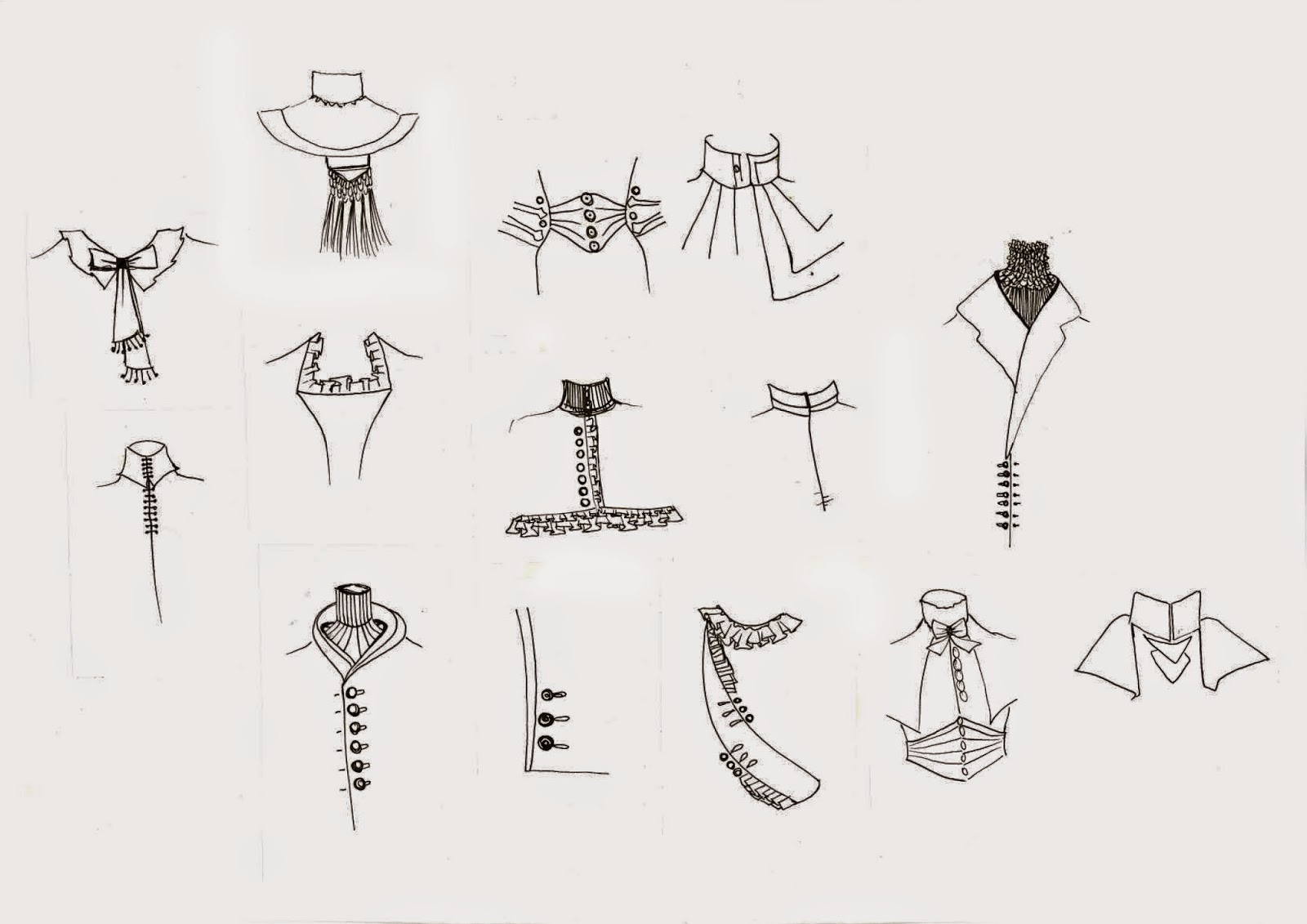
Today I decided to pick out the main details repeated throughout Edwardian dresses, and line them in pen and shade in water-colour. This brought out the delicacy of each detail and inspired me to turn these into some sort of design; textile or development. The shape and silhouette of the dresses remained very similar throughout the entire period, but the details alter dependent on what the dress was for and who would wear it. Similar detailing was used across dresses, this was interesting as the difference between day and evening wear wasn't in shape, length or silhouette. The main differences was the cut of the shoulders and collar, and the detailing on both of these. 

Most dresses included some sort of lace, whether in the form of a collar detailing, skirt trim or simple add-on's to sleeves and shoulders. The embroidery on some of the dresses was intricate, one dress included gold thread all over made to look like layers upon layers of peacock feathers. The dress supposedly 'lit up' when entered the room. Each part of the embroidery was made by hand, and the dress would only have been worn but the richest aristocracy at the finest balls. 

One detail I kept picking out was the incredible amount of layering, every dress had a huge amount of layers, petticoats, skirts, aprons, added lace, frills, jackets, bodices and coats. This could have been due to how cold houses were, or simply to show how much a person could afford simply through the amount of material they wore. 

The colours I picked for the water-colour were mainly based on how I associate wealth with colour. Dyes in that period would have been very expensive, meaning the darker richer colours would only be worn by the wealthiest. Seeing as I am focusing this project on the rich people of the Edwardian Period, I used blues, purples and reds to colour my sketches. I hope to include maybe a gold or white, perhaps in the form of a lace or laser cutting as a physical response.

As I wanted to use these drawings to further my development, I photocopied (enlarging and duplicating) a few of the sketches. With these I can turn them into textiles like prints or embroidery, or simply cut and paste them onto a body to rearrange where each detailing could go. As I only did a few, I feel I need to step my game up and produce at least three times this amount. On top of this, this weekend I shall start to try to recreate some of these on a mannequin. This will help me understand the fabrication methods, and also physically alter where each detail could be placed. I will record this process and start some designing from there. I think I also need a little more research on fabrication, but a trip to the V&A tomorrow should provide a good basis.